User talk:Embyr 75/Sandbox
From Retro Modding Wiki
Gradient Colors
Adding gradient colors for backgrounds for these templates, hope to eventually make a universal "box" template that can be used to create new Notice Templates, with the gradient-color-functionality built in. Colors can be chosen and changed later, more concerned with if people like the gradient function right now. We could probably discuss the progression here, so others can input their opinions. Embyr 75 (talk) 12:37, 25 January 2015 (CST)
- To have it out in the open, my two cents are mainly that I like the light colors, and the gradient is nice but I'm split on whether I prefer the flat color or the gradient; gradient's definitely nice but I like the simplicity and uniformity of the flat colors. Interested to hear other peoples' input. --Parax0 (talk) 12:46, 25 January 2015 (CST)
- Personally, I prefer the gradients. Sweeping up to white looks particularly good, but if you want something more eyecatching, maybe go from one shade of purple to another? IMO, going straight from purple to white looks a little weird. Bearborg (talk) 12:55, 25 January 2015 (CST)
| To do: Light purple to lighter purple. |
- Definitely like the lighter to darker purple gradient more than the purple to white. I made some morphball images that I thought would work great for noticed that pertain to showing the file format progress. For example:

|
This file format is not documented This file format has either no or very little documentation. More research is needed. |

|
This file format is partially documented This file format may have some functionality but is still not completely understood and still needs further research. |

|
This file format has been completely documented This file format has been completely understood and no further research is needed. |
- Note how the ball goes from wireframe, to untextured, to fully rendered, to denote the progress of the file. Hope you guys like it! --MrSinistar (talk) 15:06, 25 January 2015 (CST)
- The only issue I have with the purple gradient is I feel like once it starts getting to be darker it starts clashing with the black text a little bit. It's still completely readable, but makes me feel like even that shade of purple is just a bit too dark.
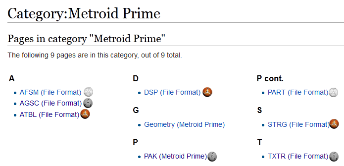
- I wonder if we could expand on MrSinistar's idea with the morph ball a little to display smaller versions of that on the category pages. That way someone could go take a look at the Metroid Prime category, for instance, and quickly see the status for every format right from the category page. --Parax0 (talk) 15:15, 25 January 2015 (CST)
- Thanks everyone! I'll go and make the templates for the file formats notices, if that's cool with everyone. As for the purple gradient, how about inverting it like this?
| To do: Light purple to lighter purple. |
- I'll look into see if we can add small icons like that to the article names in the categories. Just to make sure we're on the same page, something like this?
- If so, I think that requires a fair amount of CSS and extra programming. But I think it's doable. --MrSinistar (talk) 15:26, 25 January 2015 (CST)
- I was thinking of having it before the link instead of after, but yeah, basically that. Also, I think I like sweeping down to the darker color better. Go ahead and implement the templates, would like to start sticking these on some pages. I think embyr was going to make a universal box template for this kind of thing though, and I'm not sure if she's done with that, so we might need to remake it later? --Parax0 (talk) 15:30, 25 January 2015 (CST)
- Hey MrSinistar, I think it'd be nice to have one or two more intermediate notices. Can you think of what could be used as icons for that? Maybe vertices? Like in the pak format, for example, the structure is 100% known; it's just file ordering that needs a slight bit more research. But it's small enough that I don't think it's really accurate to say we only have a partial understanding of it. Also, I don't think we should ever really say no more research is needed. No matter how much we know about a given format, there's always the chance that there's something we missed about it. Also also, I'd kind of like to try changing the names of the templates if that's alright with you :P --Parax0 (talk) 15:48, 25 January 2015 (CST)
- The CSS side of that would actually be pretty simple, I've already written it. The hard part would be the code that determines which image to show. Maybe Parax or someone who knows more than me could implement custom CSS classes for the file progress? Bearborg (talk) 15:51, 25 January 2015 (CST)
